The Porsche logo is one of the world’s most recognisable brand identities. But did you know that the striking coat of arms first adorned a Porsche in 1952? As a new brand new crest is unveiled, we tell its story
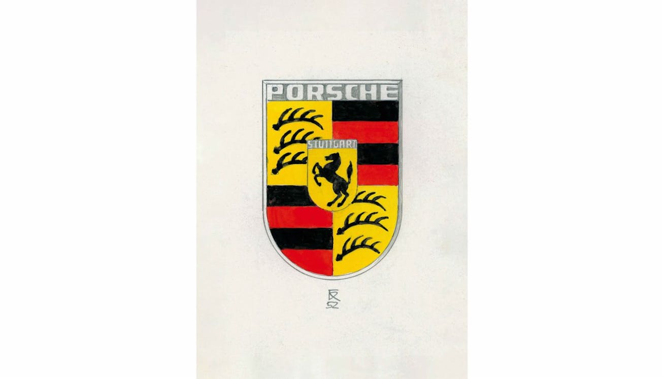
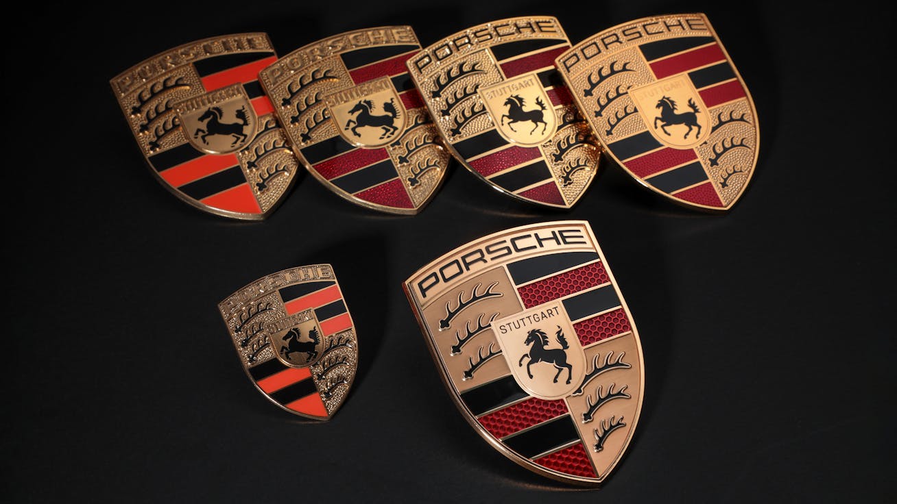
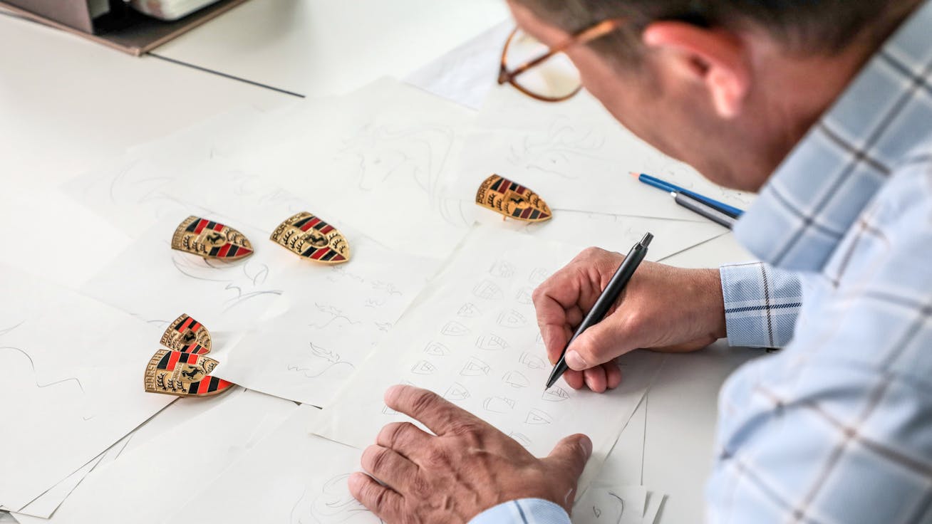
Recognised the world over, the Porsche logo is synonymous with high-performance vehicles and has been a symbol of the company’s unwavering commitment to quality for many decades. Yet few know the fascinating story behind the birth of this ‘crest’, as Porsche itself calls the logo. While internally at the company it is in fact only the PORSCHE lettering that officially represents the ‘logo’, of course fans the world-over view the entirety of this crest as the Porsche logo, and thus why we’ll refer to it as the Porsche ‘logo’ throughout this article. The start of this logo’s story? It traces all the way back to a 1951 design competition.Who designed the Porsche logo?Although lettering with the name ‘Porsche’ first started featuring on the bonnets of sportscars made in Zuffenhausen in 1950, it would be three more years before the idea to create a genuine trademark began to take hold. It started when Porsche and Ottomar Domnick, a Stuttgart doctor and original Porsche customer, organised a design competition among German art academies in 1951. Although the prize pot was set at 1,000 Deutsche Mark, none of the submitted designs managed to win them over. Instead, another idea piqued the interest of Ferry Porsche… and it would come from New York City, the place where modern marketing, advertising and brand awareness was born.It was here that Max Hoffman – an Austrian-born US car importer who specialised in European sportscars – played a crucial role in the idea to create a Porsche logo. After winning an award for the most interesting car at the Watkins Glen Concours d’Élégance for the first Porsche 356, which Hoffman imported to the US, he saw the potential to create a quality seal that would visually appeal to customers and create a unique identity. At a business dinner with Ferry Porsche in New York in 1951, Hoffman urged him to develop a symbol that reflected the company’s roots and conveyed the quality and dynamism of his products. His pitch patently struck a chord.The now iconic Porsche logo first made an appearance in 1952 on the steering wheel of the Porsche 356What animal is on the Porsche logo?For the design of the Porsche logo, Franz drew inspiration from Stuttgart’s city seal, which features a rearing horse, and incorporated this into the centre of the shield shape. Since Stuttgart itself was founded around 950AD as a centre of horse-breeding and stud farms, the animal was a fitting addition to the emblem. The word Stuttgart is in fact derived from a small ducal stud farm, ‘Stuotgarten’, which was situated near the Nesenbach stream in the area. The horse ultimately symbolises the power, agility and elegance of Porsche cars.The new Porsche crest (bottom right) for 2023 onwards, along with several examples of previous versions of the iconic logoWhat do the Porsche logo’s colours represent?While the horse represents strength, the red and black stripes on either side are reflective of the traditional crest colours of Württemberg-Hohenzollern. What’s more, the stylised antlers were also taken from the region’s coat of arms. To top it off, the name of the city that Porsche calls home is visible above the horse.How has the Porsche logo changed over the years?Franz Xaver Reimspiess’s design has shown to have incredible staying power across the decades. His Porsche logo was first seen on the steering wheel of the Porsche 356 in 1952, on hubcaps from 1959 and on on Porsche hoods from 1965. Although the design has gone through several revisions over the decades, the fundamental elements have remained the same – it’s been a case of light refinements and proportional adjustments. One notable outlier was when the race-ready 911 GT3 was given a painted Porsche badge in lieu of the traditional enamel-coasted logo. Shedding even this small amount of extra weight lent an advantage to the car’s speed when on the track. And in June 2023, to tie in with the 75 years of Porsche sports cars anniversary, a new Porsche crest was unveiled – its seventh iteration. It’s been carefully modernised with minor revisions, but as with all previous examples, doesn’t stray too far from the essence of the original.Over a period of three years, Style Porsche designers worked with the marketing team to develop a fresh, modern take on the newly unveiled Porsche crestWhat is the new Porsche crest?“With its cleaner and more state-of-the-art execution, the refined crest communicates the character of Porsche,” explains Michael Mauer, Vice President Style Porsche, whose designers worked with marketing experts from the sports car manufacturer over three years on the project. “We have reinterpreted historical characteristics and combined them with innovative design elements such as a honeycomb structure and brushed metal. The result is an aesthetically ambitious arc that bridges the history and the future of the brand.”These subtle evolutions – allied to the Porsche quality associated with it – means that the Porsche logo has always maintained a contemporary feel. As time passes, the look of the Porsche logo will continue to evolve but will undoubtedly continue to honour that now unmistakeable original design of more than 70 years ago.
The history of two-door Porsche sportscars
Discover the origins
Continue reading
How does Hot Wheels make Porsche model cars?
Ever wondered how model cars are made? Hot Wheels designer, Dwayne Vance, tells us about the process and how he designed a unique Porsche off-roader
Read more
Download Porsche 911 GT3 RS wallpapers by Callum Dewar
Bring the thrill of the Porsche 911 GT3 RS (type 991.2) to your home screen. We’ve teamed up with automotive photographer Callum Dewar to offer his original images as downloadable wallpapers for your phone or desktop
Read more
Download Porsche 911 GT3 RS wallpapers
Download a beautiful Porsche 911 GT3 RS wallpaper for your phone or computer’s home screen
Read more