Creating Porsche race car poster art with Jake Yorath
Bold, stimulating paintings and posters from the British artist
Copy link
Share on Facebook
Share on X
Share on LinkedIn
Manufacturers like Porsche, race series, racing teams and global brands flock to this British automotive artist for inspiring artwork that’s fresh yet instantly recognisable
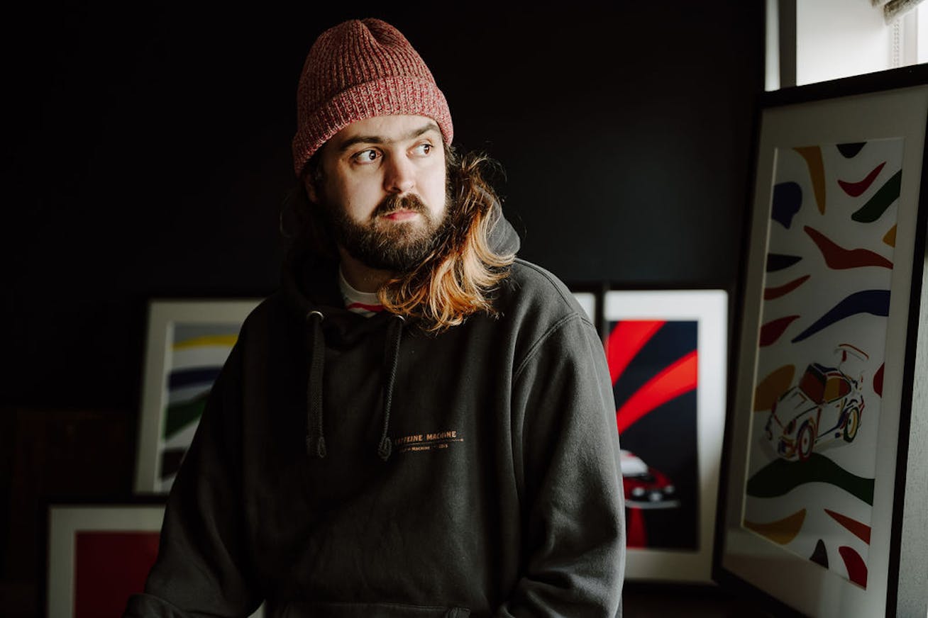
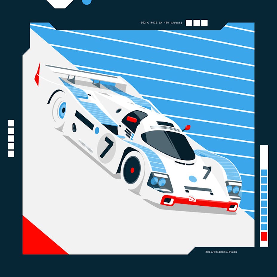
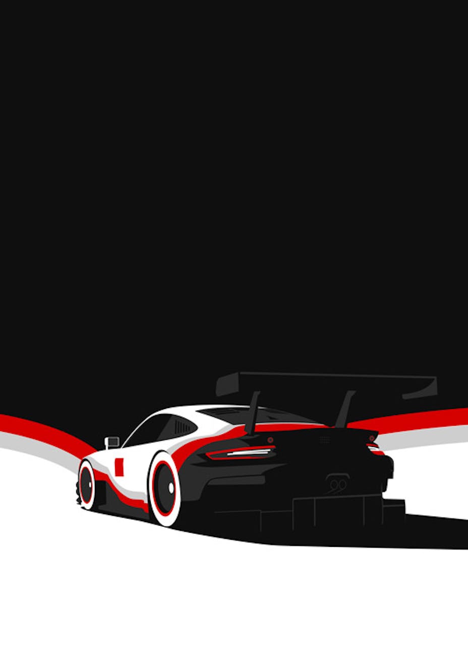
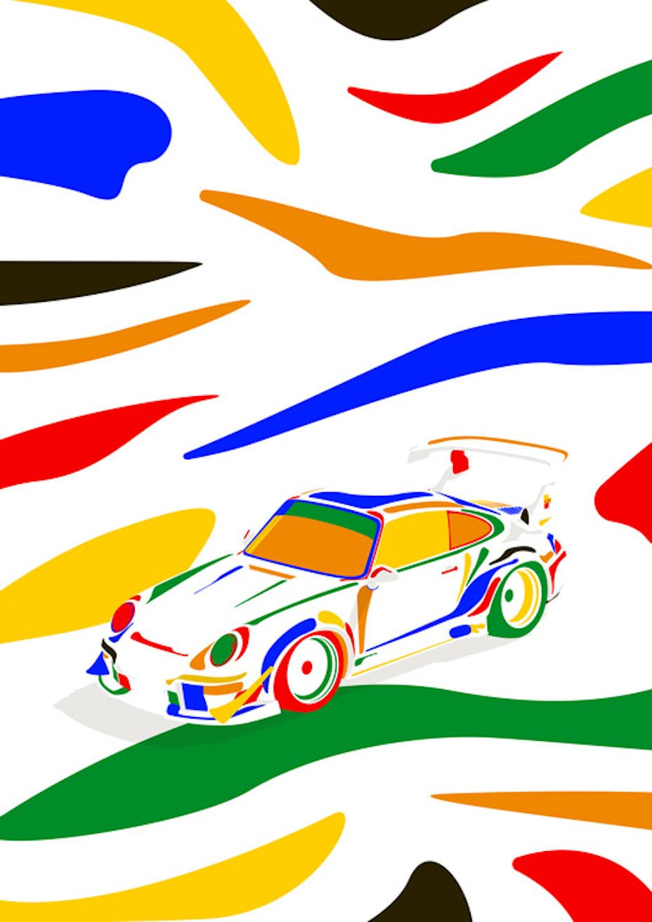
One of the greatest gifts that art gives us is its ability to help us reinterpret and inspire new ways of looking at something familiar. For illustrator and graphic designer Jake Yorath, hyper-real interpretations of cars in the motorsport art that he majors in rather misses the point. Whether it’s his striking posters for the British GT, Formula 3 and Porsche GB Carrera Cup championships or his unique, digitally created race car art, his work is vivid and full of movement, with colours that jump out and grab you. “I like to use a lot of negative space,” says the Bristol-based artist, an English city renowned for being a cultural and creative hub. “And I like to use a limited colour palette. That’s the technical term… but then I was never trained.”Jake is indeed almost entirely self-taught – he’s a huge proponent of YouTube tutorials – having spent his entire working career so far in the creative side of motorsport. Previous roles have included photographer, designer, editor and PR, but the 32-year-old has now settled into a groove as one of the go-to names for race teams and brands when it comes to motorsport art. It’s art that steers clear of cliché, while displaying a healthy respect for some of the masters of the craft.British automotive artist Jake Yorath: “It’s about bold colours and shapes and interpreting them in my own way” Photo: Tess VieraThe inspiration behind the Porsche race car art of Jake YorathBrought up in a town just 40km north of the Silverstone circuit, several of Jake’s strongest childhood memories revolve around race cars – like the photo of him sat in Michael Schumacher’s 1994 Benetton F1 car when Jake was just five. Within a couple of years he was attending British Touring Car Championship races, intoxicated by the noise, the speed, the competition and, especially, the colourful liveries – the building blocks for the race car art he produces today. At home, he was surrounded by motorsport memorabilia, with access to his stepfather’s vast collection of Group C racing videos: “I spent a lot of time making LEGO models based around them,” Jake recalls.Jake Yorath’s head-turning illustrations are a celebratory, colourful and innovative Photo: Jake YorathThese days his creations have a wider audience, with his work taking inspiration from a broad range of stylistic influences personal, classical and beyond. Created solely by digital means in Adobe Illustrator, InDesign or Photoshop using his Mac and a mouse, a sizeable portion of Jake’s work is limited to just three colours. A dark green, for example, may be used as the main colour for adding a layer of shading to darken areas rather than adding a black. “It’s just about using as little as possible,” says Jake. “The less you use, the cleaner [it is], and the more the art can speak for itself without being overwhelmed by everything else that’s going on.”Creating a Porsche 991 RSR poster You can see it in one of the more striking prints on his website, that of a Porsche 991 RSR in white, monochrome and red hues. Jake’s treatment of wheels in his race car art consistently standout, using minimal blocks of colour for maximum impact. “I like that experience where you create something and then your mind has to fill in some of the blanks,” he says. “You’ve got white wheels on a white background and with the tyres, you're filling in those gaps yourself. Your brain is like ‘Oh, yeah – tyres, I know what they look like, they must be there.’ I really like that.” Using a limited colour palette, like on this Porsche 991 RSR, produces a striking effect Photo: Jake Yorath“I remember years ago coming back from the Ashmolean,” Jake says, of a visit to Oxford’s famed museum of art and archaeology. “And I had been looking at loads of Greek vases. It was funny – they weren’t dissimilar to what I do now with the contrast in colours with their bold and simple shapes.”
Look at Arabic art. It’s all geometric and looks complicated – but look at it more closely and it’s actually very simple. The best art for me is always simple
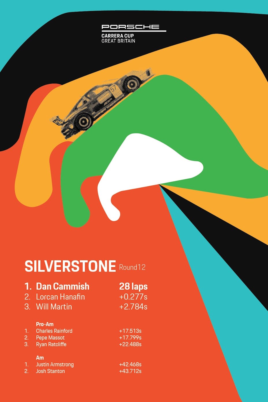
The great English landscape painter, JW Turner, French contemporary Pop Artist, Malika Favre, and even the colourful way his mum decorated their Christmas tree are further diverse influences on Jake’s race car art. “What makes Turner so good – as well as his ridiculous ability with paint generally – is just its simplicity,” he says. “Look at Arabic art. There’s a lot of really cool tiles and text. It’s all geometric and looks complicated. But when you look at it more closely, it’s actually very simple. The best art for me is always simple.”Jake’s vibrant artwork has become a popular choice for race series, like Porsche Carrera Cup GB Photo: Jake YorathCentral to Jake’s art is the way he represents original motorsport liveries. The much plainer, unadorned nature of road cars means that when it comes to subject matter, it is race cars that predominate – especially those in the golden period that spanned the 1960s into the mid-1980s. “It really wasn’t until the 1960s that race liveries started appearing,” explains Jake. “For what I do, a livery is important because I find if I’m trying to do something for a car without a livery, it’s a lot harder. It’s about those bold colours and shapes and interpreting them in my own way. Not copying them but changing and developing them in another way. Liveries are like art wrapped onto something, so what I’m trying to do is then unwrap it and then flow it across a canvas.”Porsche posters and design dreamsWhile by no means a single-marque artist, there’s no doubting Jake’s affection for Porsche. Several of his outstanding Porsche Carrera Cup GB victory posters – created in advance and then updated with the actual results, post-race – are a nod to the ground-breaking motorsport art of Erich Strenger. He was the man who, for four decades, created the adverts, brochures and race posters for Porsche, as well as launching its long-running magazine, Christophorus. Like Strenger, confident and innovative use of typography dominates. But while it’s important that these convey the necessary information, first and foremost they are memorable race car art.Exotic and iconic: this render of a Porsche 911 (993) GT2 is one of Jake’s favourite designs Photo: Jake Yorath“I think a lot of the personality of Porsche comes from its long history of doing things their own way and not really worrying about what other people think. For me, it’s about their years and years of amazing posters. So, when I started doing some posters for Porsche, it was a dream come true. If you’d asked me what I wanted to do when I was 18, making posters for Porsche would have been high up there. And here I am now, doing just that,” Jake says of his exciting, celebratory designs.
The 911. A work of art. Forever
Choose your 911
Continue reading
The Porsche Cayenne Turbo Electric joins Fortnite
For a limited time, gamers can secure the flagship SUV in Fortnite
Read more
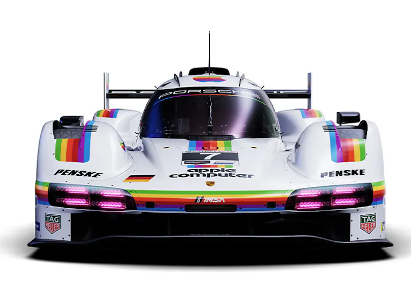
The story behind the livery of an iconic partnership between Porsche Motorsport and Apple
In celebration of 75 years of Porsche Motorsport and 50 years of Apple, the Porsche 963 driven at the 2026 IMSA WeatherTech Raceway Laguna Seca event wore a special livery
Read more
Which Porsche is in League of Legends: Wild Rift?
A new collaboration with Riot Games brings Porsche into League of Legends: Wild Rift – both in-game and in the real world.
Read more